
How to Center an Image in HTML and CSS
Contents
When it comes to designing a website, one of the most common challenges is properly aligning and centering images. To align and center images in HTML and CSS, there are a few different approaches you can take. In this article, we’ll learn three different methods you can use to center images on your web pages using HTML and CS.
We’ll transform the web page from this:

to this:

HTML and CSS Template
Use the code below to create the web page above:
HTML
<h1>Welcome to My Website</h1>
<img src="https://www.bannerbear.com/images/ghost/2023-10-31-3-ways-to-generate-open-graph-images-automatically/5.png" alt="" class="img">
CSS
.img {
  width: 400px;
}
🐻 Bear Tips: You can copy and paste the HTML and CSS to your code or duplicate this CodePen template to follow along with this tutorial.
Centering an Image in HTML and CSS
Method 1: Using CSS Flexbox
Flexbox is a powerful CSS layout that allows you to arrange items in rows or columns to create flexible and responsive web pages. It aligns and divides space among items in a container to best fill the available spaces. Depending on the item’s size and the available space, the item can be expanded or shrunk, thus the name “flex”.
To center an image using Flexbox, place the image within a container, such as a <div> and give it a class or ID:
<div class="image-container">
  <img src="https://www.bannerbear.com/images/ghost/2023-10-31-3-ways-to-generate-open-graph-images-automatically/5.png" alt="" class="img">
</div>
Then, apply the following CSS properties to the container element:
.image-container {
  display: flex;
  justify-content: center;
  align-items: center;
}
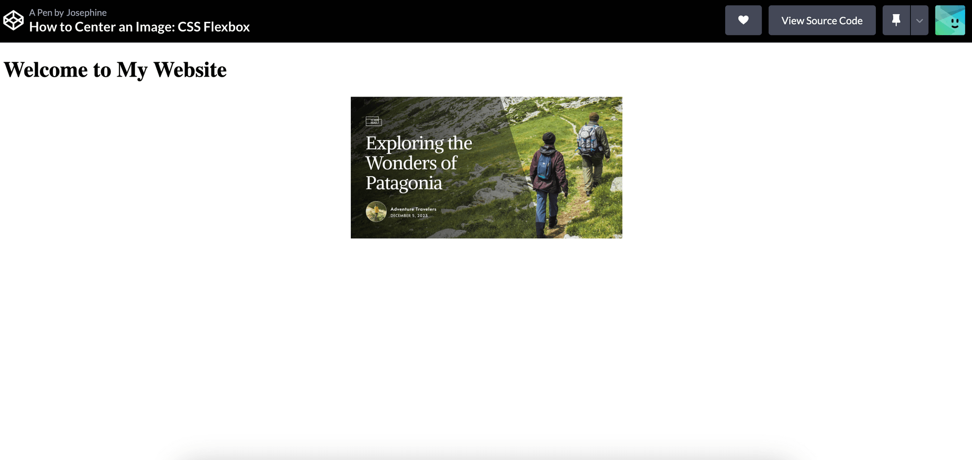
The justify-content property is used to align flex items along the main axis of the flex container, which is “row” (horizontal) by default. On the other hand, the align-items property is used to align flex items along the cross-axis of the flex container, which is “column” (vertical) in this case.
When both values are set to center, you are centering the flex items both horizontally and vertically within the flex container:
CodePen
### Method 2: Using CSS Grid
CSS Grid is another modern CSS layout system that provides powerful grid-based layouts with rows and columns. Unlike Flexbox which supports only one-dimensional layouts (either rows or columns), CSS Grid allows you to create layouts in both directions simultaneously.
To center an image using CSS Grid, place the image within a container, such as a <div> and give it a class or ID:
<div class="image-container">
  <img src="https://www.bannerbear.com/images/ghost/2023-10-31-3-ways-to-generate-open-graph-images-automatically/5.png" alt="" class="img">
</div>
Then, apply the following CSS properties to the container element:
.container {
  display: grid;
  place-items: center;
}
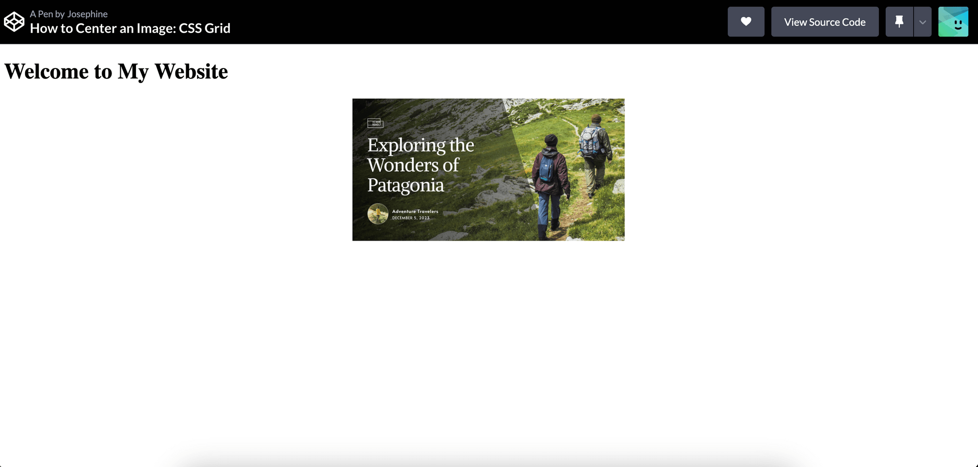
The place-items property is a shorthand property for align-items and justify-items in CSS Grid. The CSS place-items: center; sets the value of both properties to center:
CodePen
🐻 Bear Tips: Although they sound similar, the
justify-contentproperty is exclusive to CSS Flexbox while thejustify-itemsproperty is exclusive to CSS Grid.
Method 3: Without CSS Flexbox or Grid (Traditional Techniques)
Flexbox and Grid are very useful for responsive designs that adapt to different screen sizes or more complex designs. If your layout design is simple and no other complex layout requirements, traditional layout techniques or inline styles could also be sufficient.
Like other methods shown previously, place the image within a container, such as a <div> and give it a class or ID:
<div class="image-container">
  <img src="https://www.bannerbear.com/images/ghost/2023-10-31-3-ways-to-generate-open-graph-images-automatically/5.png" alt="" class="img">
</div>
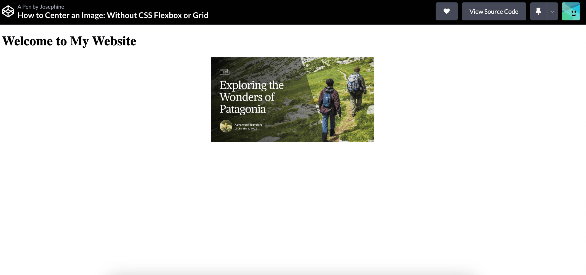
If the image is the only item within the <div>, you can center it simply using the text-align and vertical-align properties:
.image-container {
  text-align: center;
}

.image-container img {
  vertical-align: middle;
}
This will center the image within the container:
CodePen
## Which Method is the Best for Centering an Image?
Each method has its advantages and use cases. You should choose the best method depending on your specific needs but here is a general guide:
- Flexbox - Great for creating flexible and responsive layouts that involve dynamic content where the size of items can vary. If your layout involves simple alignment of items in a row or column, Flexbox is often simpler to use.
- Grid - Ideal for more complex layouts with multiple rows and columns, especially for responsive designs that adapt to different screen sizes. It allows you to create grid-based designs and control the placement of items within the grid cells.
- Traditional techniques - If your layout is simple and you don't require complex positioning or responsiveness, traditional layout techniques can be sufficient. It is also a good choice when you need to support older browsers that do not fully support Flexbox or Grid.
Conclusion
Centering images in HTML and CSS is essential for creating visually appealing web pages. The choice between Flexbox, Grid, or traditional techniques depends on the specific layout requirements and the level of control you need over your design. Besides that, other factors like browser support, readability, and maintenance are also worth considering. Remember, always consider the specific needs of your project and choose the approach that best fits those requirements!
More HTML and CSS tutorials: