
How to Create Box & Drop Shadow Effects in Bannerbear
Contents
Shadows are a powerful design element in Bannerbear, allowing you to add depth, dimension, and visual interest to your images. Whether you're working with simple shapes, image frames, or text, shadows can elevate the overall look and feel of your designs.
When used effectively, shadows can draw the eye, create a sense of hierarchy, and make elements stand out. This can be especially helpful when generating large batches of images for social media, marketing, or e-commerce applications. By defining consistent shadow styles, you can maintain a cohesive look across your brand assets.
In the following sections, we'll provide a quick overview of how to use shadows in the Bannerbear editor. We'll also include a few sample templates for you to duplicate and play with on your own. This will give you a hands-on opportunity to experiment with shadows and customize them to fit your design needs.
By the end of this tutorial, you'll have a solid understanding of the Bannerbear shadow property and how to leverage it to add depth, dimension, and visual interest to your images. Let's get started!
Understanding Box Shadows and Drop Shadows
Both CSS box shadows and drop shadows are powerful visual effects used extensively in graphic design, but they serve slightly different purposes.
- The box-shadow property adds a shadow effect around the entire rectangular area of an element. This creates a subtle depth and dimension, making the element appear lifted off the background.
- The drop-shadow property creates a shadow that conforms to the exact alpha channel of the input image or graphic. Rather than a rectangular shadow, this produces a shadow that perfectly matches the shape of the object. This is particularly useful for elements with transparent backgrounds or irregular shapes.
Bannerbear's shadow property is styled after CSS, following an easy format that we'll cover in the next section. This format allows you to apply shadows to shapes, frames, and text within the Bannerbear editor.
How to Add Shadows to Your Elements in Bannerbear
Adding a shadow effect to your Bannerbear template is incredibly easy and can be done while you set up the rest of your element. Log into your Bannerbear account (or sign up for a free trial account if you don’t have one—no credit card required! 🥳), create a new template, and navigate to the editor. Then, follow these steps:
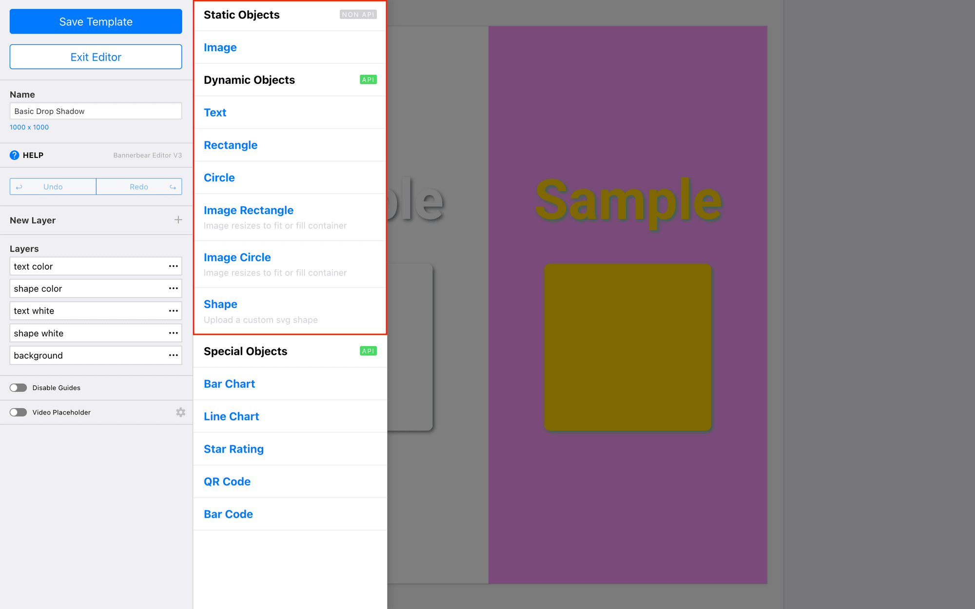
Step 1 - Add a Shape, Frame, or Text Layer
Add a new layer to your template, selecting one of the layer types from the menu.
Shapes (rectangles, circles, SVGs), frames (rectangles and circles), and text are all shadow property-compatible.
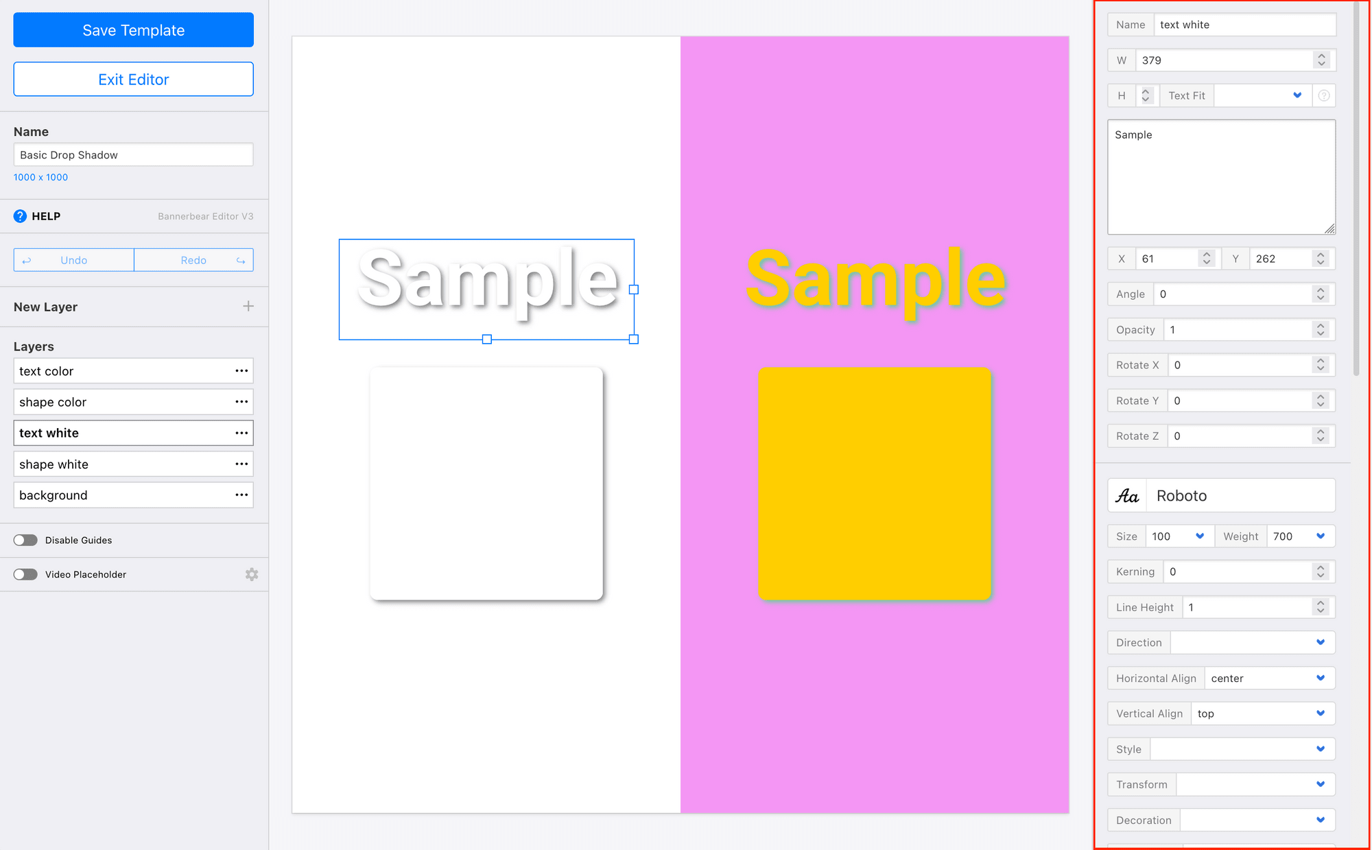
Step 2 - Customize the Element
Use the toolbar to customize the element as desired. Adjust the size and color, add text, or add pictures into any frames.
You might also find it helpful to customize the background and any static elements to get a better idea of your final product. This will help you see whether your shadow matches the end design well.
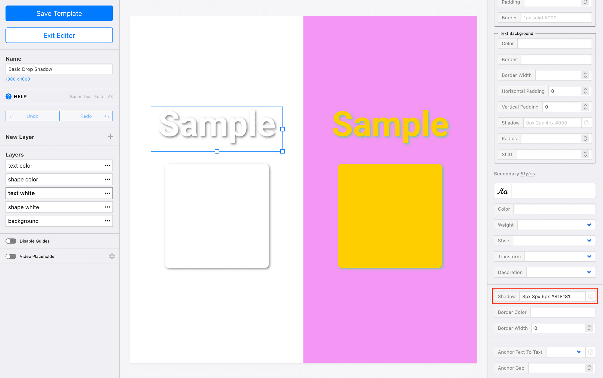
Step 3 - Enter Shadow Property Values
Now, select the element that you wish to add a shadow to. On the right sidebar, you’ll find the toolbar for customizing the selected element. In the Shadow field, add your property values according to this format:
Bannerbear Shadow Property Format : {offset-x} {offset-y} {blur-radius} {color}
Watch the shadow be applied to your element, and make adjustments as needed.
Drop Shadow Ideas & Examples
You aren't limited to basic box shadows in Bannerbear. CSS-style styling means there are a wealth of possibilities at your fingertips.
We have some inspiration to get you started. Duplicate any of our examples below, or copy-paste the property value into your own template as a starting point.
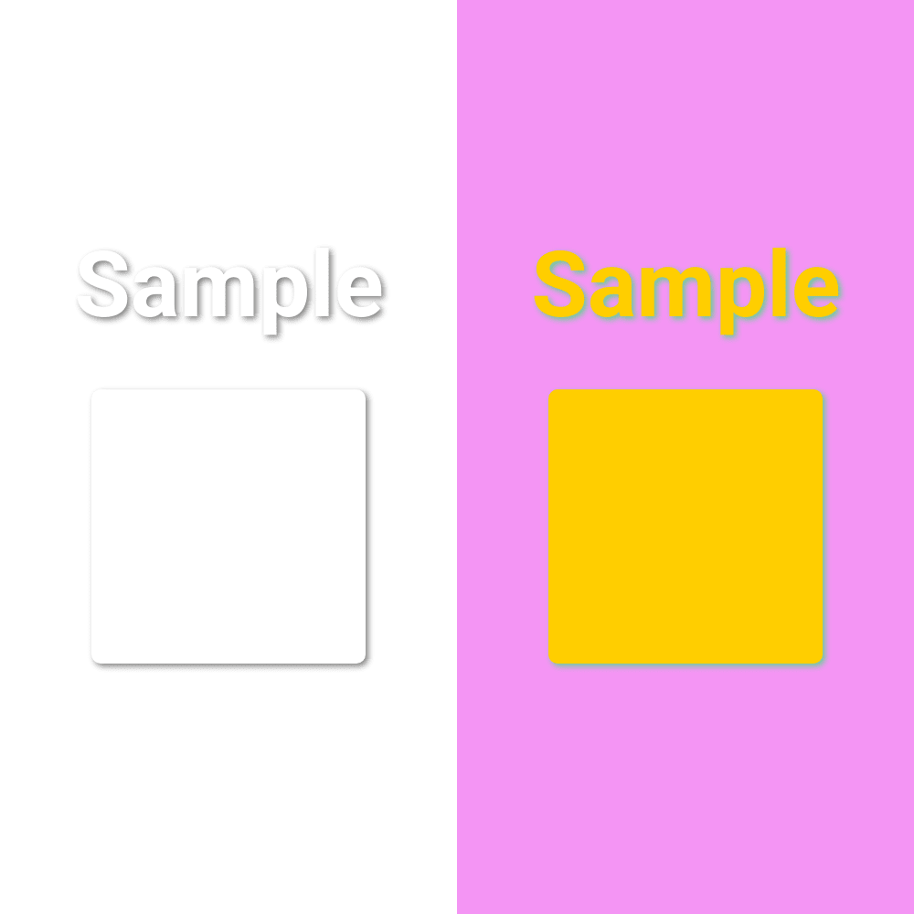
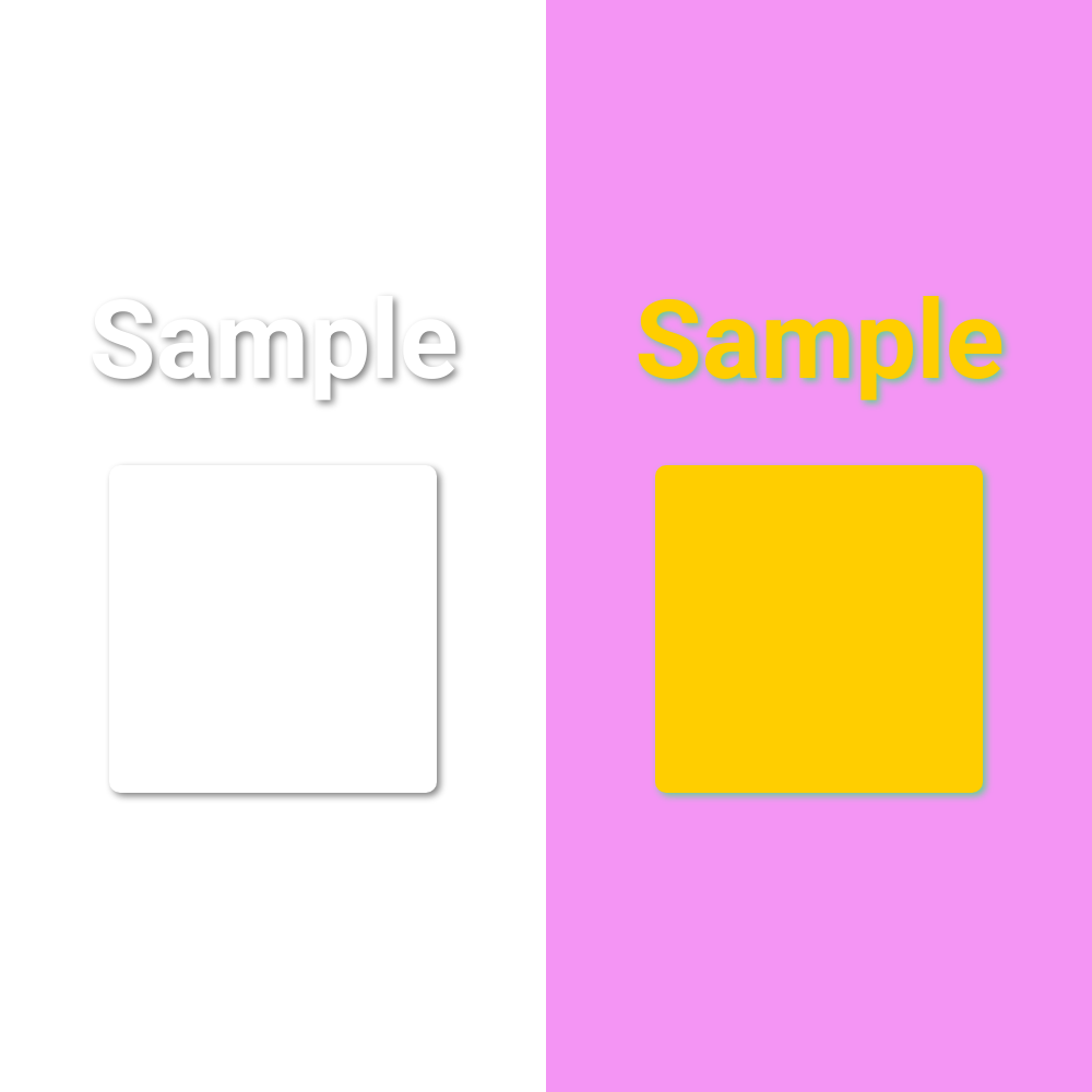
Create a Basic Shadow
A basic drop shadow can be applied quickly to create a consistent look across your images. They add some visual interest without overwhelming the viewer.
Basic Drop Shadow Sample Value: 3px 3px 6px #818181
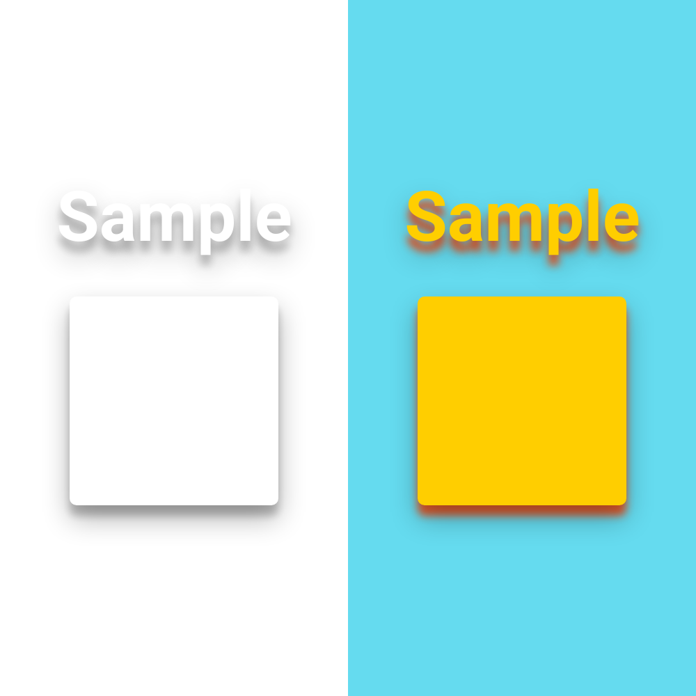
Play with Transparency
Hex colors can also include transparency values, making them 8 characters long instead of 6. This allows you to add more softness and complexity to your shadows.
Popout Drop Shadow Sample Value : 0px 19px 38px #0000004d, 0px 15px 12px #00000038
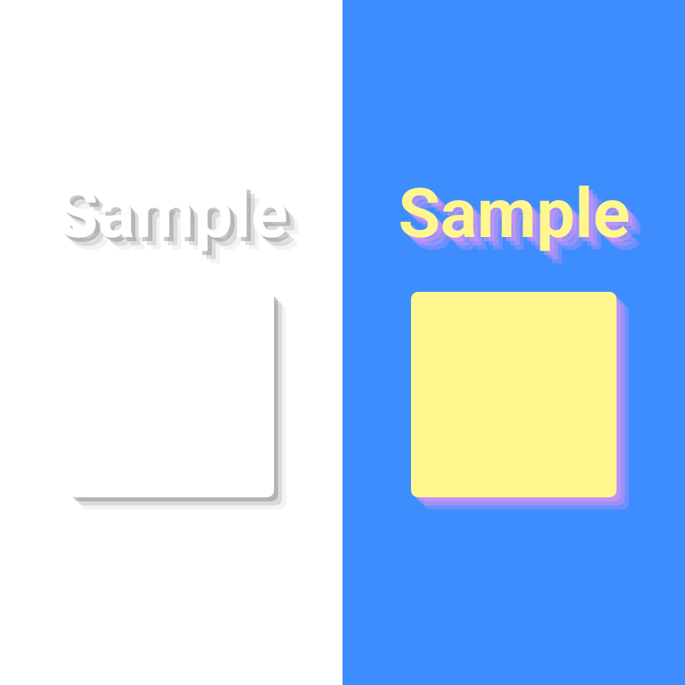
Layer Your Shadows
You can add multiple shadows by separating each property string with a comma. They can be layered next to each other, or set on different sides of your shape for a whimsical, standout look.

Layered Drop Shadow Sample Value : 6px 6px #7b7b7b66, 12px 12px #a1a1a14d, 18px 18px #c5c5c533
Try Inset Shadows
Another interesting way to add shadow effects with the inset keyword, which can be used with rectangles and circles in Bannerbear. This allows you to create an embossed or cutout effect.

Cutout Drop Shadow Sample Value : 3px 3px 6px 0px inset #ccdbe8, -3px -3px 6px 1px inset #ffffff80
Bear Tip 🐻: The
insetkeyword can be used with rectangles and shapes, but is not compatible with SVGs and text.
Conclusion
Shadows are a powerful design tool in Bannerbear that can add depth, dimension, and visual interest to your images. By leveraging box shadows and drop shadows, you can create a range of effects to complement your design aesthetic. Experiment with different shadow properties and layering to find the styles that work best for your brand and marketing needs. With the techniques covered in this guide, you'll be able to elevate your Bannerbear designs and make your visuals pop off the screen.