Use the Responsive Settings in your template to control what happens to a layer when the canvas is rendered at a different size than the original. These settings will instruct each layer how to behave when the template is resized during rendering.
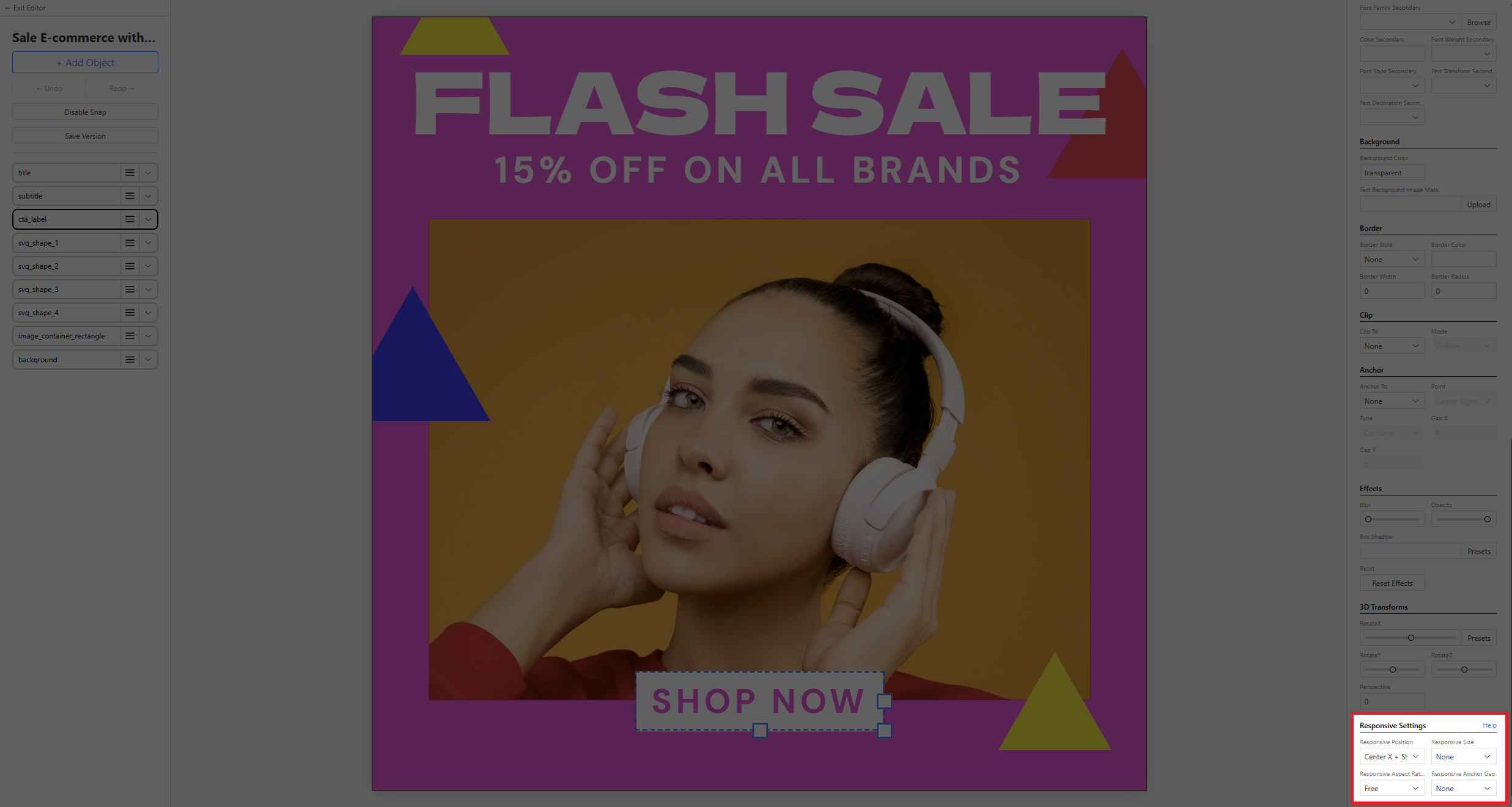
🐻 Bear Tip: These settings much to set per individual layer in your template.
Position
- None — same x/y coordinates.
- Scale — x/y are multiplied by the canvas ratio.
- Shift X / Y / both — if the canvas grows by 50px, the layer moves by 50px on that axis.
Size
- None — same width and height.
- Scale — width, height and font size are multiplied by the canvas ratio.
- Stretch X / Y / both — if the canvas grows by 50px, the layer grows by 50px.
Scale vs Shift / Stretch: Scale multiplies by the canvas ratio. Shift and Stretch change by the same number of pixels the canvas changed by.
Aspect Ratio
- Free — width and height change independently per the size setting above.
- Locked — the layer keeps its current aspect ratio. The dimension that grows more drives the other. Useful for circles or any layer that should stay proportional.